The Card Designer in Deck Builder 3.6.0 turns from a quick layout tool into a real card editor. Three new controls give you precise command over how a card looks: borders, per-text typography, and pixel-level positioning. Open a deck, tap + Add Card → Design Card, pick a layout, and follow along.
Preset borders
At the bottom of the designer, the Border row offers five one-tap styles: None, Thin, Thick, Double, and Inset. Tap one and the card frame updates instantly in the live preview.
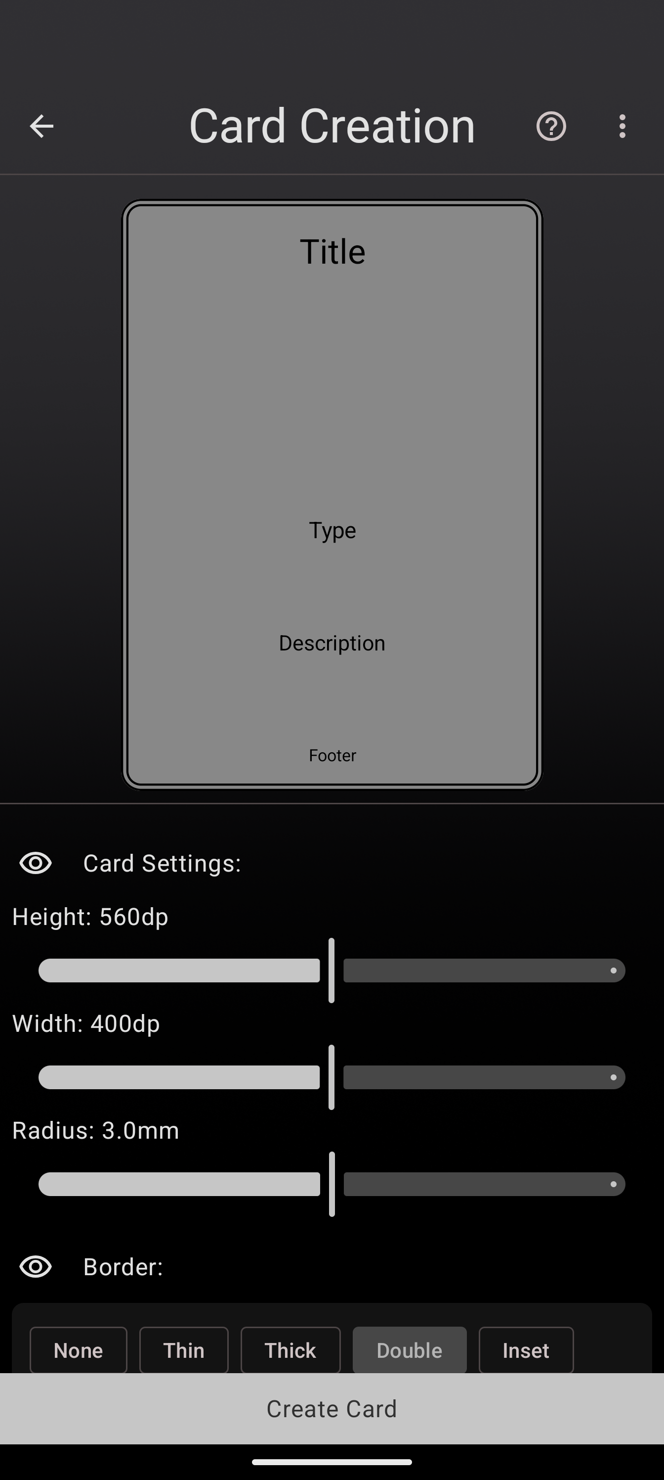
Double and Inset are great for a classic trading-card frame; Thin keeps things modern and clean.
Fonts and sizes, per text object
Every text object now carries its own Text-style panel. Select a text field’s control row, open the TT panel, and you get a Text size stepper and a Font picker.
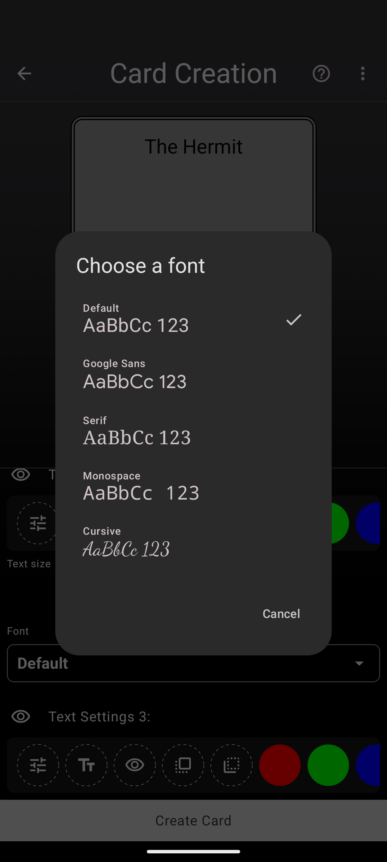
Choose from Default, Google Sans, Serif, Monospace, and Cursive, each shown with a live preview. Because the setting is per object, your title can be a bold display face while the rules text stays in a clean sans, all on the same card.
Fine-tune: move, scale, and rotate by the pixel
The Fine-tune panel (the sliders icon on each object’s control row) adds precise, tappable controls for Move (a direction pad), Scale (zoom in/out), and Rotate (left/right).
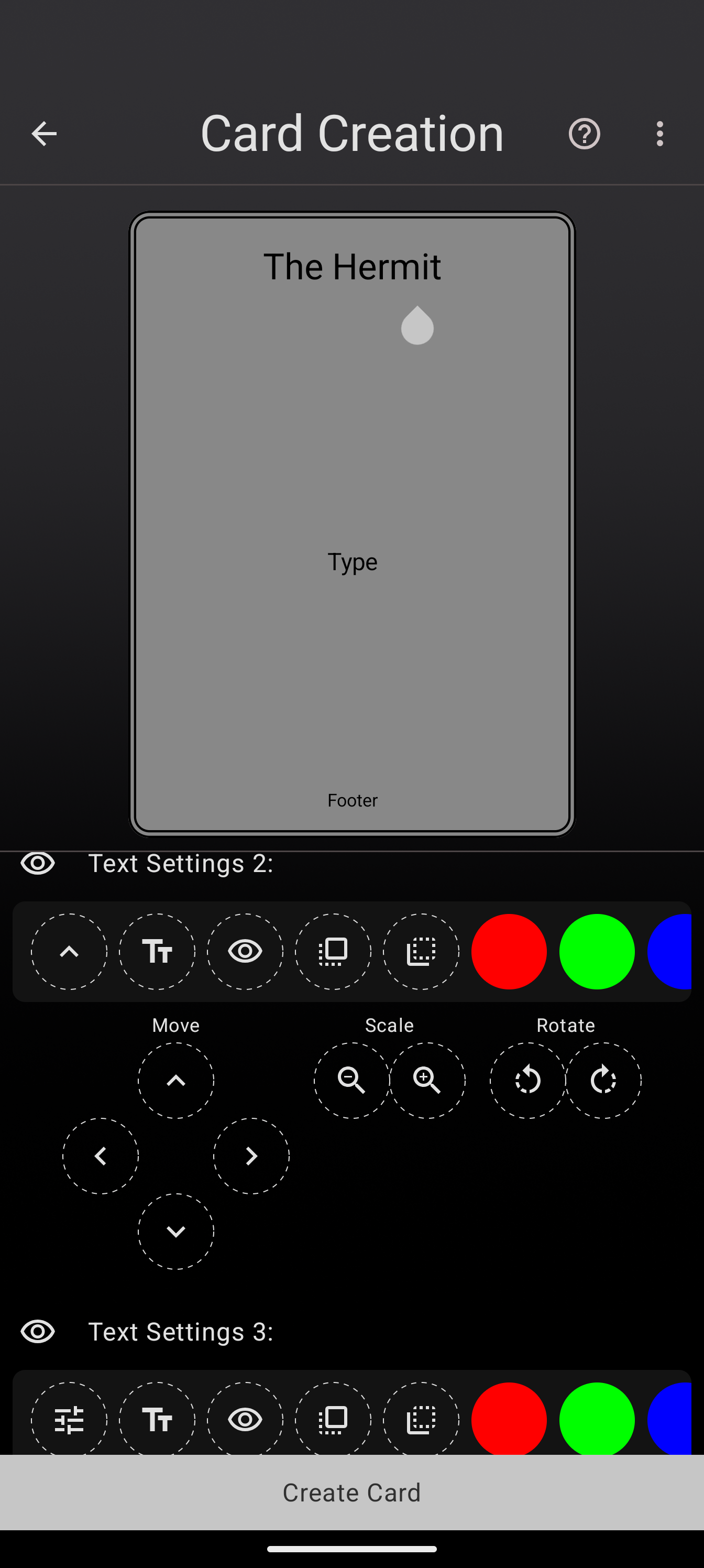
This is the reliable way to line objects up exactly, especially for small adjustments that are fiddly to do by dragging. It drives the same transform as the pinch gesture, so you can rough-place by hand and then nudge to perfection.
Update to Deck Builder 3.6.0 from Google Play, and see everything new in 3.6.0.